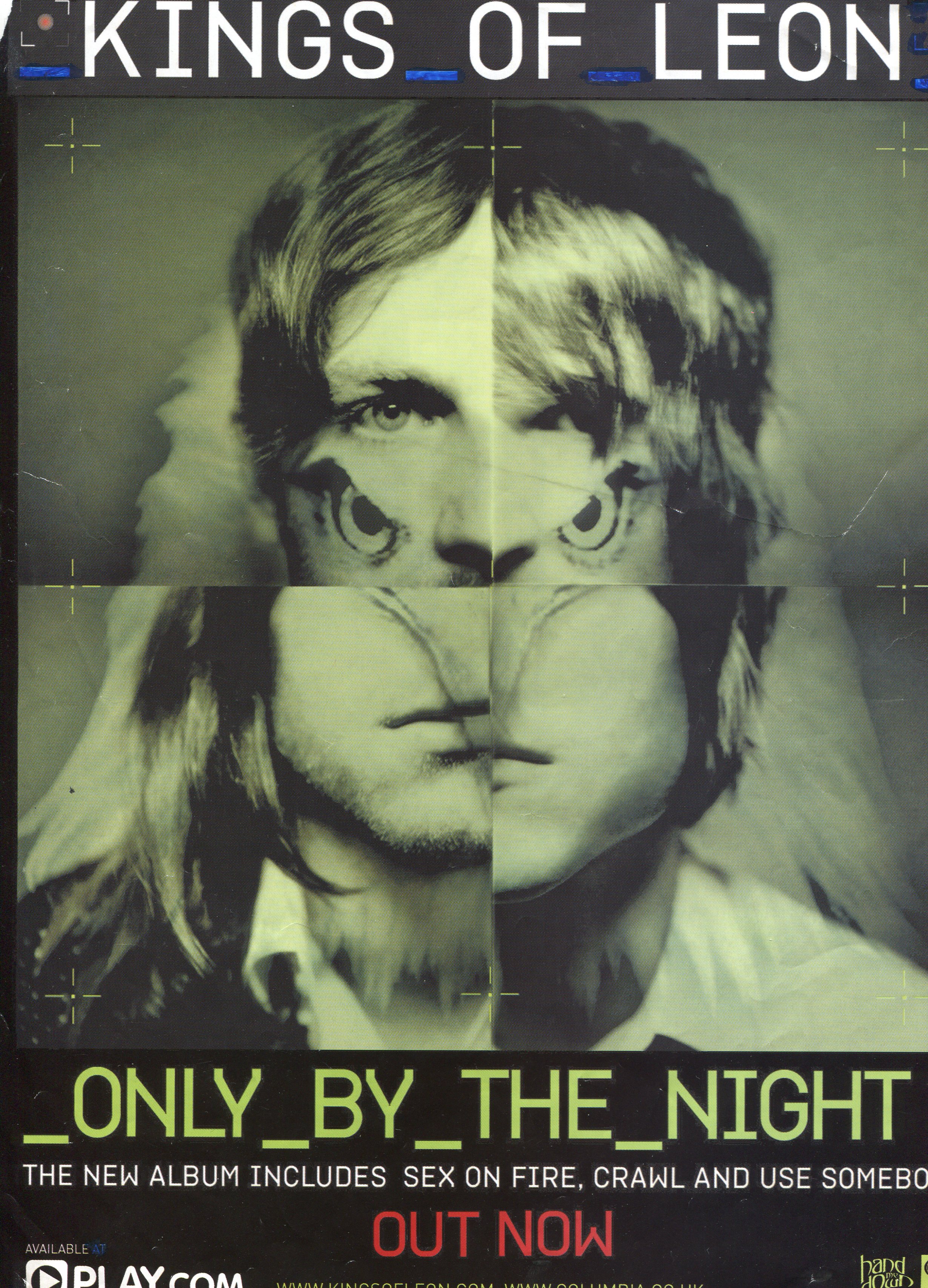
When creating my magazine advert I need to ensure there are clear links between that and my digipak. These examples have used the artist or album artwork to promote the CD within the magazine advert, and this is something similar to what I wish to achieve.
Album cover has been used, title clearly shown, consistent font, lets viewer know where to buy it from, record label logo, simple, dark background, bold text
Album cover has been used, release date provided, includes the names of well known singles, record label, website address, images of the band, bold title
Album artwork has been used, bold release date, ties in with colour scheme, bright colours, eye-catching, platforms are discussed, website is provided, record label logo, addresses shops which you can buy the music from

Bold title and band name, image of the band that features on the album cover, blurs into background at the edges, a lot more writing in comparison to the other adverts in this post, subtle release date - it's not as bold as the title, record label logo, website

Album artwork, blends into black background, bold album title and band name, emphasises it's their new album, featured singles, record label logo, website is mentioned

Extended album cover image, fits the a4 page, features band, star rating, bold title and band name, release date, record label logo, featured songs, various platforms of music
Album artwork blends into dark background, bold title and band name, release date, label logo, simplistic but bold

Various fonts used, star ratings, busy, lots going on, lots of writing in comparison to others such as the one above, recommends which store to buy from, record label logo, included tracks, available platforms

Simple, features album cover against black background, record label logo, website included, bold title and artist name, same colour scheme used for text as well as the album cover


No comments:
Post a Comment