Natural scenery, balloons, cloud in the sky - something I am thinking about including
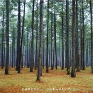
Title is too subtle, text is not bold or interesting enough, good use of trees and natural scenery
Interesting font, simple shot, blue and white subtle shot, complimenting colours
Cloudy background with earthy colours, bold white font, more writing than usual on the cover, nice use of lines to frame the text
No text on the cover, something I might consider adhering to, interesting mise en scene, not made to look pretty like a lot of other albums
Simple album cover, natural scenery, looks like a green filter has been used, adds another perspective of light
Unusual cover because of the lack of text and a different style of image, not a photograph, looks like a hand painted or inked one
Bold text, someone other than the artist on the cover
Interesting layout of words, contrasting bright yellow, unusual choice
Vintage style photo, the border frames the image nicely, subtle handwriting font used in the corners, a handwriting font similar to ones I am thinking about using
Painted effect, not a photograph, unusual yet could be the depiction of the band
Simple cover, mysterious photo as the object isn't easily identifiable, top left hand sticker to display band and album name
I'm interested in usually framed images, as this circle contrasts with the black background, super imposed image as a waterfall has been placed in the middle of a city
I like this cover because of the white text on a washed out photo, subtle, colours aren't in your face, smoke effect, can be achieved with a filter or screen
Unusual pattern, marbled effect, white faded text blends in
Close up of shells, natural objects, faded text, not too clear, not easily read
Quirky photo, the different fonts create an alternative effect, fit into that genre, stands out from the darker purple background


No comments:
Post a Comment