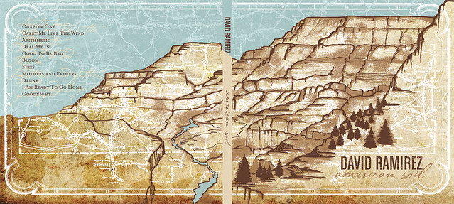
4 panels, shows front and back, font can be read clearly, image stretches over the two panels shown, tracklist seen on back, no barcode? spine adheres to the colour scheme, not the imagery

4 panels, image continues over these two panels and onto the CD, vintage effect, blue white and red colour scheme

6 panels, purple is the main colour, text stands out, yellow on purple etc, tracklist on the back, information on the inside panels also, CD has the same imagery on it as the panel behind it
Simple, blue and green colour scheme, white font stands out from the background, 4 panels, tracklist contains times as well as song names, spine has the same font as the title
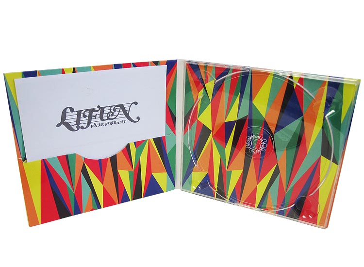
4 panels, same pattern and colour scheme, CD slot and pouch to put a booklet in, abstract shapes, eye catching, bold colours

The same junk, odd bits and bobs theme has been used throughout, random letters spell out the album title, the inside panel contains the tracklist, handwriting font, barcode on the back, interesting to look at because of all the different components


No comments:
Post a Comment