Showing posts with label Album Artwork. Show all posts

Friday, 8 November 2013

Further development of Digipak Conventions

I have developed the conventions of these Digipaks by using the same image on my front and back cover. These examples of artwork demonstrate the idea that a photo can be used on more than one panel, to create a patterend digipak that is eye catching and professional.


This digipak has used a certain image on the front, and then a magnified section of that image has been used on the back. This, although slightly different to mine, shows the same idea that an image, regardless of which section, can be used on both the front and back of the artwork.


The same circular pattern has been used on the front and back of this digipak to create a fun and eye-catching pattern.


The same image has been used on the inside of this digipak; the image has been reversed on one side, so they mirror each other. This is a subtle change to the design, yet the same image remains.

This (the front and back cover of the inside panels above) also shows the same image on both panels, however it has been stretched to create a panorama effect. The same colors, pattern and scene, like created on my digipak. 


The exact same pattern has been used on both panels, and this creates a bold and exciting digipak. 


 This is an inside booklet that uses a similar pattern throughout its pages, and demonstrates the idea I had to use the same image and theme throughout all of my products.  


Tuesday, 15 October 2013

Designing the Back Cover

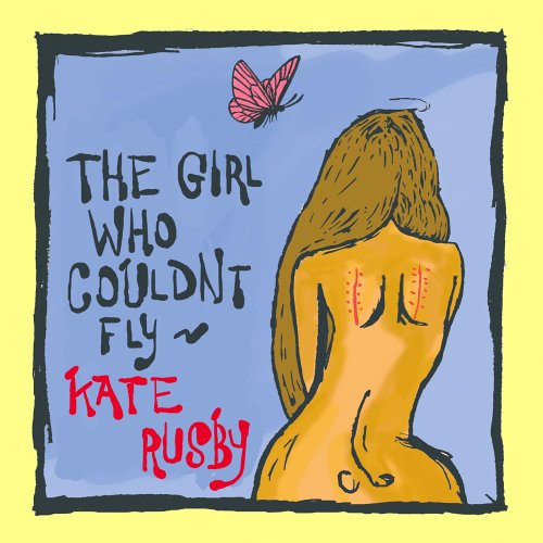
I have used the same photo that features on the front cover, but I have removed the volume image and used a different filter to edit this with. I have kept the light patterns and leaks that can be found on VSCOcam and Afterlight as in this instance it makes the image brighter and happier.  

I then decided to include track listing, copyright laws, a barcode and the record label logo, as these are conventions found on previously looked at digipaks. 
On each back cover the logo, barcode and copyright information are in the same place. The barcode is neatly displayed in the bottom right hand corner, next to it features a small yet easily visible Island Records logo. Producer and copyright information are displayed using smaller white text that is subtle, however I feel it is still easy to read. 

A Gentle Touch
I really like the looped handwritten effect, as it is similar to my chosen font on the front cover of my digipak. I like the amount of space left at the top and bottom of the track listing, as it doesn't risk being cut off, yet it doesn't look lost on the panel. I think the white really stands out and is easy to read.

Brain Flower
Even though I really like this font, I have to agree that it doesn't match my front cover and the handwritten style that I want to go for. The lines are also too thin and not clear enough to read, meaning that this font isn't a choice for my back cover.

Brain Flower (option 2) 
I thought that maybe a different layout would make this font look better, or maybe even the back cover as a whole, however I am unsure. I feel that even though it looks nice, the words are lost and too small in comparison to everything else featured. I think if I made it a larger size, the fact it does not match my theme would be even more prominent. 

Dawn of New Day
The scrolling font used here can be described as pretty and definitely matches the theme of my digipak. However, some words are not so clear to read because of the thin lines used. 

Signerica
I really like this font, it has to be one of my favourites and is exactly what I wanted my back cover font to look like. However, after putting it on the digipak and seeing how it portrays the album titles, I can see it won't work. The lines are not strong enough and the words cannot be deciphered easily, meaning that the album titles cannot be read. Also, it doesn't match the font of my front cover; going from an easily read font to a not-so-easily-read font does not depict a consistent theme. 

So Lonely
This font is not one I would choose for anything. It strikes me as old fashioned and even though it is in the handwritten style, the calligraphy is too scrolled and cannot be read too easily. Several words are not presented in a way which I would want them, so this font is not one of my choices. 

You Wont Bring me Down 
Even though this font is clear and easy to read, I do not feel that the font is pretty enough, and it seems quite basic; almost childlike. I don't think it looks right on the back cover, so I will not be using it as one of the choices. 


Chosen Font:
(final draft back cover)  

Never Let Go 
In order for my digipak to be consistent within its theme and the way it looks, I will use the same font as chosen for the front cover. The font that runs through the digipak will also be featured on the magazine advert to bring the two items together to form a clear link. I feel the writing on the back cover is bold, clear and easy to read, as well as portraying the style and handwritten effect I planned for. 

Monday, 14 October 2013

Photos for CD panel

DSC_0077DSC_0095DSC_0094DSC_0093DSC_0092DSC_0091
DSC_0078DSC_0079DSC_0080DSC_0081DSC_0082DSC_0083
DSC_0084DSC_0085DSC_0086DSC_0087DSC_0090

CD Panel images, a set on Flickr.
To experiment with various flowers for Rosa-Leigh to hold I used several flowers from my garden and from bouquets of flowers within the house.

The smaller pink flower is pretty, however I think it is lost in her hands, and looks too small in contrast to the large orange flower. I like the orange flowered photos best, however I am unsure as to what it will look like when on the CD panel of my digipak; I will experiment with various tools and effects to make it tie in with the digipak theme and colour scheme. The dried rose is subtle and vintage, however I am also unsure about what it will look like in relation to my digipak.

Wednesday, 9 October 2013

Designing the Album Cover

My initial photo was taken of a vase of sunflowers in my house. After editing it on apps fpr iPod such as VSCOcam and Afterlight I decided to experiment with the volume buttons; an idea I gained from looking on Instagram. After adding further light leaks and filters
I decided I liked the overal effect and decided to use it for my album cover.

I then added a bold 'sticker' on the left hand side to draw the audience's attention to the album namethat will be featured within. I then thought of putting the artist's name in it too, however I realised there would not be enough room, so I thought of putting it in the bottom right hand corner. I then began to experiment with fonts, sticking to the theme of handwritten styles.

A Gentle Touch
I liked this font but was unsure about spacing in between the letters, as they are tightly packed together and I wanted something that was more free.

Always in my heart
Even though it is grammatically correct, the style of the capital A, in my opinion, doesn't match the album cover. The writing at the bottom is too rounded and it's not a font I wish to use.

Brain Flower
I like the shaky, skeletal style of the font, however I don't feel it matches my style of album cover.

Brain Flower (option 2)
I then experimented with the sizing of the font, making beautiful bigger and overlapping with the edges of the circle. I titled the font so it wasn't parallel with the edges of the volume button. Even though it looks interesting I still don't think  it matches my album cover.
 
You wont bring me down
I think the font is too thin and not bold enough for people to read it easily, therefore it is not one of my main choices for my album cover. It seems too sketchy and thin, it doesn't acheive the style that I want it to.


Chosen font:

 
Never Let Go
This is my favourite font and the chosen style to use as my album cover. I like the handwritten effect and the boldness of the text,as it is easy to read yet still looks authentic and matches my style and theme.


Monday, 7 October 2013

Female Artist Album Artwork

I have decided not to include Rosa-Leigh on the front cover of my album cover, as she is a professional and renowned artist who doesn't need to sell her music based on her brand or look, but on what it sounds like. These album cover show how you can advertise and sell and album, even though the artwork doesn't contain an image of the female artist.