I have decided not to include Rosa-Leigh on the front cover of my album cover, as she is a professional and renowned artist who doesn't need to sell her music based on her brand or look, but on what it sounds like. These album cover show how you can advertise and sell and album, even though the artwork doesn't contain an image of the female artist.
♫ ♫ ♫ ♫ ♫ ♫ ♫ ♫ ♫ ♫ ♫ ♫ ♫ ♫ ♫ ♫ ♫ ♫ ♫ ♫ ♫ ♫ ♫ ♫ ♫ ♫ ♫ ♫ ♫ ♫ ♫ ♫ ♫ ♫ ♫ ♫ ♫ ♫ ♫ ♫ ♫ ♫ ♫ ♫ ♫ ♫ ♫ ♫ ♫ ♫ ♫ ♫ ♫ ♫ ♫ ♫ ♫
Showing posts with label Influences. Show all posts
Monday, 7 October 2013
The Sticker Effect
A circle added onto an album cover can be used to include the album title and band or artists name, in an usual and neat way. These album covers adhere to this different convention; something which I wish to include on my album cover also.
Sunday, 6 October 2013
Magazine Adverts 3

Plain background, colour stands out, album artwork has been used, various platforms have been mentioned, 'out now', website plus other information such as tour dates have been included, band logo as well as record label logo
Mentions the availability of the formats in music, bold title and band name, clear release date, 'new' album makes it sound exciting, website has been included
Hand-drawn effect, clear release date, band and record label logo's, album artwork used in contrast to black background, consistent font, bold, stands out
Extended album cover to fit A4, bright and colourful, eye-catching, release date, songs it includes, website, record label logos
Extended album cover, release date, clear band title and album name, interesting as there seems to be a hand pulling back the page - yet it is part of the advertisement, makes it different and unusual, includes mentioned songs, record label logo and website are included

Album cover blends into white background, clear title, exciting and eye-catching graphics, record label logo, 'out now', includes mentioned singles, bonus track also, makes the audience feel like they are getting exclusive content and more from their favourite band, various platforms also mentioned
Dark, a lot of writing at first glance, image that stands out taken from album cover, black background contrasts with the writing, star rating and quotes from various publications, record label logo, website
Album cover added onto orange background, clear album and band name (self-titled album) eye-catching graphics, clear release date, QR code also supplied, featured songs, website, record label logo
Magazine Adverts 2

Simplistic, album image has been used, bold text that contrasts with the background, no other information included
Image of the artist, bold name of artist, image of the actual CD, star rating and comment from a music magazine, record label logo
Extended image of the album cover to fit A4, recommended store to buy CD at, bold band name and album title, release date, record label logo, website also included
iTunes is where the album is available, websites are provided for fans, bold title and name of album as well as the album image against a white background, includes famous songs, 'out now' in its various platforms
Extended image of the album that fits A4, record label logo, bold title and band name, release date, website, no further information, simplistic
Album cover in the centre of the page, large bold and unusual title, 'in stores', release date, further information is given however the small font means I cannot read it

Album cover from 'Kiss of Life' has been used, bold name however the album name isn't given, prize nominated, quote from a newspaper, 'out now'
Magazine Adverts
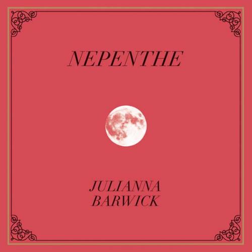
When creating my magazine advert I need to ensure there are clear links between that and my digipak. These examples have used the artist or album artwork to promote the CD within the magazine advert, and this is something similar to what I wish to achieve.
Album cover has been used, title clearly shown, consistent font, lets viewer know where to buy it from, record label logo, simple, dark background, bold text
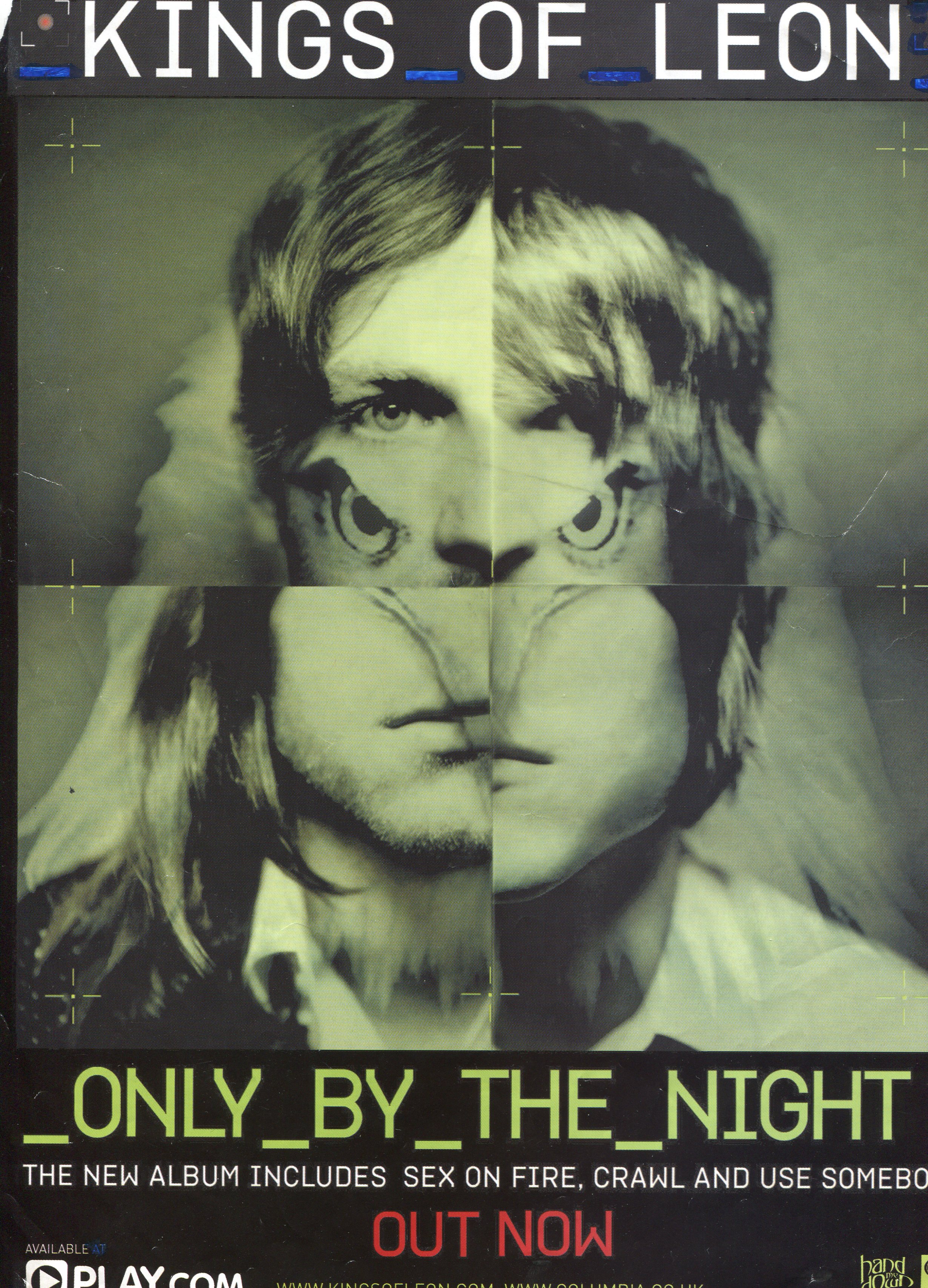
Album cover has been used, release date provided, includes the names of well known singles, record label, website address, images of the band, bold title
Album artwork has been used, bold release date, ties in with colour scheme, bright colours, eye-catching, platforms are discussed, website is provided, record label logo, addresses shops which you can buy the music from

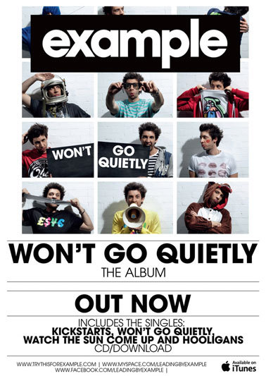
Bold title and band name, image of the band that features on the album cover, blurs into background at the edges, a lot more writing in comparison to the other adverts in this post, subtle release date - it's not as bold as the title, record label logo, website

Album artwork, blends into black background, bold album title and band name, emphasises it's their new album, featured singles, record label logo, website is mentioned

Extended album cover image, fits the a4 page, features band, star rating, bold title and band name, release date, record label logo, featured songs, various platforms of music
Album artwork blends into dark background, bold title and band name, release date, label logo, simplistic but bold

Various fonts used, star ratings, busy, lots going on, lots of writing in comparison to others such as the one above, recommends which store to buy from, record label logo, included tracks, available platforms
Simple, features album cover against black background, record label logo, website included, bold title and artist name, same colour scheme used for text as well as the album cover
Monday, 30 September 2013
Digipak Artwork 3
4 panels, shows front and back, font can be read clearly, image stretches over the two panels shown, tracklist seen on back, no barcode? spine adheres to the colour scheme, not the imagery
4 panels, image continues over these two panels and onto the CD, vintage effect, blue white and red colour scheme
6 panels, purple is the main colour, text stands out, yellow on purple etc, tracklist on the back, information on the inside panels also, CD has the same imagery on it as the panel behind it
Simple, blue and green colour scheme, white font stands out from the background, 4 panels, tracklist contains times as well as song names, spine has the same font as the title
4 panels, same pattern and colour scheme, CD slot and pouch to put a booklet in, abstract shapes, eye catching, bold colours

The same junk, odd bits and bobs theme has been used throughout, random letters spell out the album title, the inside panel contains the tracklist, handwriting font, barcode on the back, interesting to look at because of all the different components
Digipak Artwork 2
4 panels, cartoon style, drawn on the computer, bright bold colours, bold title and font, easy to read
8 panels, 2 CD's, blurred images, depicts scenes of everyday life, no visible link between the images, subtle colours
Natural scenery, handwriting effect, lyrics, brown and copper/orange/yellow, earth colours, constant theme
Black and white contrast (added purple) chalk, handwritten effect, minimal
6 panels, constant theme of sketchy handwritten arrows and lyrics, purple sea, natural scenery, purple is the opposite end of the spectrum to yellow, they compliment each other, image goes over two panels
6 panels, exotic, image stretches over three panels, panoramic, bold title, white contrasts with the earth tones within the plants
6 panels, all of the same image, no clear text, gives an alternative rock vibe,
Symmetrical digipak, pink purple and white, front cover isn't clear however the theme remains constant throughout the digipak, really interesting design, unsure how the back cover is read as there are two sides and upside down text
Subscribe to:
Posts (Atom)