Wednesday, 9 October 2013

Designing the Album Cover

My initial photo was taken of a vase of sunflowers in my house. After editing it on apps fpr iPod such as VSCOcam and Afterlight I decided to experiment with the volume buttons; an idea I gained from looking on Instagram. After adding further light leaks and filters
I decided I liked the overal effect and decided to use it for my album cover.

I then added a bold 'sticker' on the left hand side to draw the audience's attention to the album namethat will be featured within. I then thought of putting the artist's name in it too, however I realised there would not be enough room, so I thought of putting it in the bottom right hand corner. I then began to experiment with fonts, sticking to the theme of handwritten styles.

A Gentle Touch
I liked this font but was unsure about spacing in between the letters, as they are tightly packed together and I wanted something that was more free.

Always in my heart
Even though it is grammatically correct, the style of the capital A, in my opinion, doesn't match the album cover. The writing at the bottom is too rounded and it's not a font I wish to use.

Brain Flower
I like the shaky, skeletal style of the font, however I don't feel it matches my style of album cover.

Brain Flower (option 2)
I then experimented with the sizing of the font, making beautiful bigger and overlapping with the edges of the circle. I titled the font so it wasn't parallel with the edges of the volume button. Even though it looks interesting I still don't think  it matches my album cover.
 
You wont bring me down
I think the font is too thin and not bold enough for people to read it easily, therefore it is not one of my main choices for my album cover. It seems too sketchy and thin, it doesn't acheive the style that I want it to.


Chosen font:

 
Never Let Go
This is my favourite font and the chosen style to use as my album cover. I like the handwritten effect and the boldness of the text,as it is easy to read yet still looks authentic and matches my style and theme.




Monday, 7 October 2013

Female Artist Album Artwork

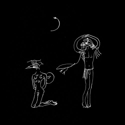
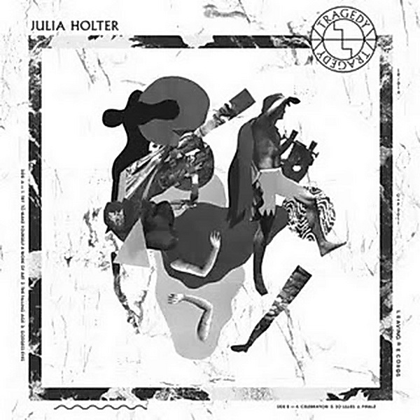
I have decided not to include Rosa-Leigh on the front cover of my album cover, as she is a professional and renowned artist who doesn't need to sell her music based on her brand or look, but on what it sounds like. These album cover show how you can advertise and sell and album, even though the artwork doesn't contain an image of the female artist. 


The Sticker Effect

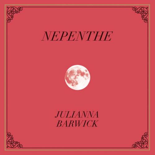
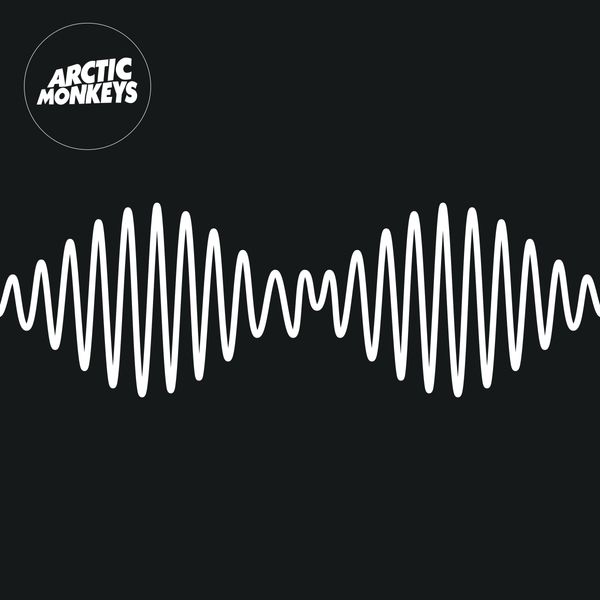
A circle added onto an album cover can be used to include the album title and band or artists name, in an usual and neat way. These album covers adhere to this different convention; something which I wish to include on my album cover also. 


Analysing Magazine Adverts

Sunday, 6 October 2013

Magazine Adverts 3


Plain background, colour stands out, album artwork has been used, various platforms have been mentioned, 'out now', website plus other information such as tour dates have been included, band logo as well as record label logo

Mentions the availability of the formats in music, bold title and band name, clear release date, 'new' album makes it sound exciting, website has been included

Hand-drawn effect, clear release date, band and record label logo's, album artwork used in contrast to black background, consistent font, bold, stands out 

Extended album cover to fit A4, bright and colourful, eye-catching, release date, songs it includes, website, record label logos 


Extended album cover, release date, clear band title and album name, interesting as there seems to be a hand pulling back the page - yet it is part of the advertisement, makes it different and unusual, includes mentioned songs, record label logo and website are included


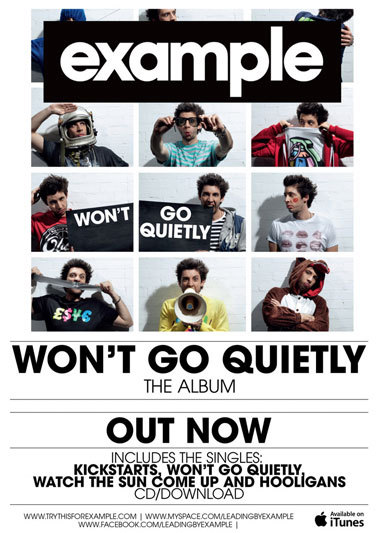
Album cover blends into white background, clear title, exciting and eye-catching graphics, record label logo, 'out now', includes mentioned singles, bonus track also, makes the audience feel like they are getting exclusive content and more from their favourite band, various platforms also mentioned 

Dark, a lot of writing at first glance, image that stands out taken from album cover, black background contrasts with the writing, star rating and quotes from various publications, record label logo, website

Album cover added onto orange background, clear album and band name (self-titled album) eye-catching graphics, clear release date, QR code also supplied, featured songs, website, record label logo

Magazine Adverts 2


Simplistic, album image has been used, bold text that contrasts with the background, no other information included

Image of the artist, bold name of artist, image of the actual CD, star rating and comment from a music magazine, record label logo

Extended image of the album cover to fit A4, recommended store to buy CD at, bold band name and album title, release date, record label logo, website also included

iTunes is where the album is available, websites are provided for fans, bold title and name of album as well as the album image against a white background, includes famous songs, 'out now' in its various platforms

Extended image of the album that fits A4, record label logo, bold title and band name, release date, website, no further information, simplistic 

Album cover in the centre of the page, large bold and unusual title, 'in stores', release date, further information is given however the small font means I cannot read it  


Album cover from 'Kiss of Life' has been used, bold name however the album name isn't given, prize nominated, quote from a newspaper, 'out now'